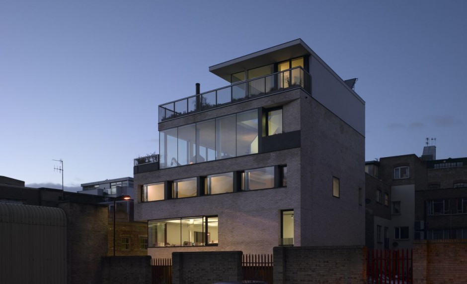
Theis and Khan is a London-based architecture group that designs everything from churches to shops, art galleries to health centers, offices to housing developments, and more. One of their recent works was an expansive mixed-use building: 3 floors of commercial space with 4 residential units above. As it turns out, the exacting clients for this particular space were themselves. This project, known as Bateman’s Row, accommodates Theis and Khan’s office space, an art gallery, and their family home in the units above. This design made the most of a restricted urban site, creating a contextual building within the busy cityscape. The interior uses elements of exposed concrete ceilings, columns, and walls, all focused around the suspended Ergofocus Fireplace.
Theis and Khan’s mission to create sustainable buildings is well-reflected throughout this project. Sustainable construction methods were adopted from the beginning and had a large impact on how the building was designed. They opted for an exposed concrete structure while using airtight insulation to enhance thermal mass. In addition, solar panels were installed to supplement hot water provision. These natural sources of heating, in addition to a green roof, give this building a softer footprint on the skin of London.

A view from the outside: The exposed concrete structure combined with airtight insulation helps increase the thermal mass of the building.

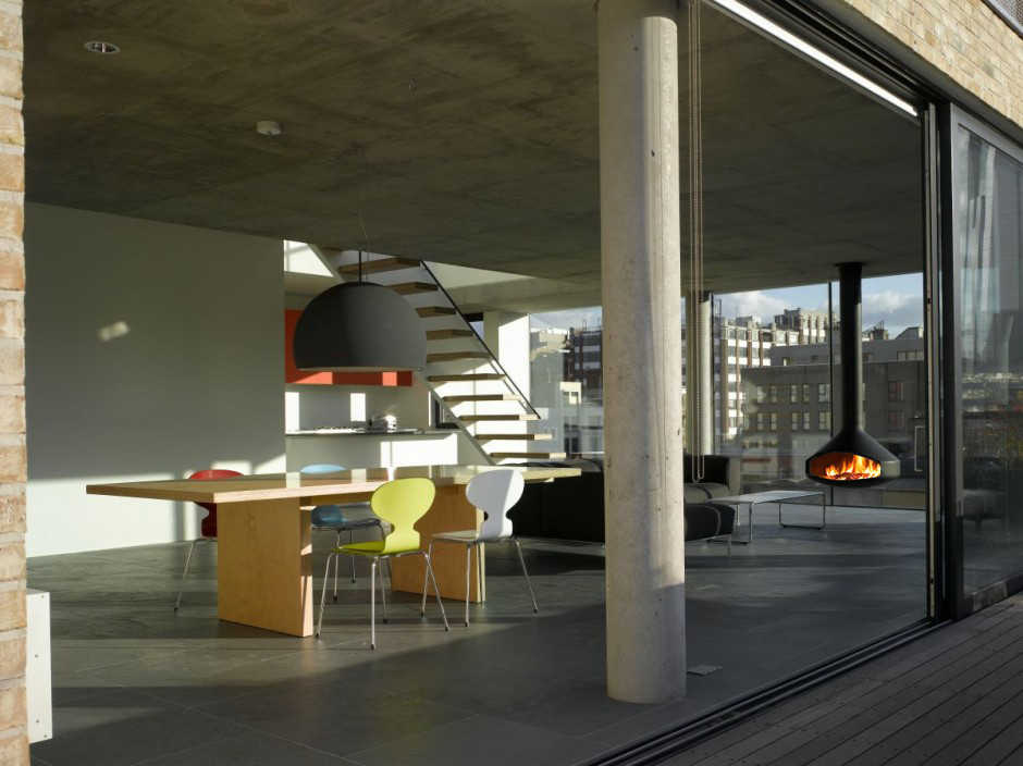
A touch of nature: floor-to-ceiling sliding glass doors blur the line between inside and out and introduce a natural breeze into this bustling cityscape home.
Theis and Khan remained mindful of the building’s aesthetics within the greater context of the neighborhood. Within the concrete frame, the highly insulated brick walls make direct reference to the surrounding Shoredich building types. The base of the building is a dark engineering brick, commonly used at ground floor level in this area to provide a strong damage-proof finish. The upper stories are designed to incorporate a yellow Danish brick that reflects the surrounding yellow London stock brick. In contrast to the rough texture of the brickwork, the windows are framed by a dark grey metal to correspond to the adjacent industrial buildings.
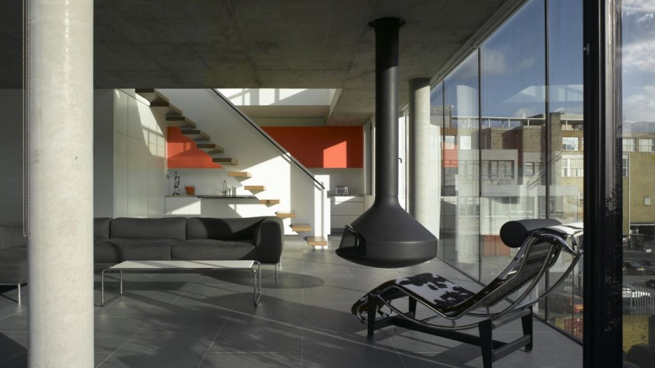
Additionally, Some of their key design features (spatial relationships, light, geometry, and proportion) are used in a unique way in this project. There is an intentional use of opposites throughout: flush and recessed, rough and smooth, dark and light, solid and void. The bold colors of the chairs and burnt orange cabinets are subdued by the dark furniture and black steel finish of the suspended Ergofocus Fireplace.

Suspending from the ceiling, the ErgoFocus by Focus Fires, is an eye-catching focal point for this space. Its vertical configuration complement the use of concrete columns throughout the space.

Form meets function: A built-in cove for firewood not only offers convenient storage, but also adds natural texture into the room.

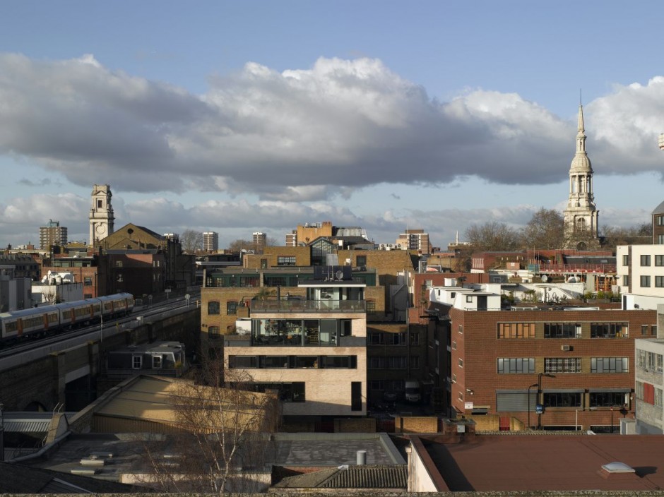
Shoredich, London: In such a densely built neighborhood, Theis and Khan worked efficiently to best utilize the space they had at hand.
This building has been awarded a RIBA London Award 2010 and RIBA London Building of the Year Award 2010. Bateman’s Row was also shortlisted for the RIBA Stirling Prize 2010.
Sources:
 Posted By: Jamie Nickerson
Disqus comments will appear here